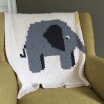
Over the years I had many people approach me on how I choose my colour combinations for my design. I love to play with colours and see how you can create interest through colour. While colour explosions can be fun too, I usually stick to a selection of 3-6 different colours per project. As a role of thumbs the more colours you choose the more difficult it gets to bring them all together. But why is this? Choosing color combinations can be a fun and creative process, but it can also be overwhelming, especially if you’re not sure where to start.
Knowing more about colour theory is a really useful skill to have. Not only for crochet using colour palette the next times you feel like giving your home a fresh new look it can make the task much more simpler. And the best thing it can easily be learned. I’m going to share my top tips with you that will make choosing your next colour combination much easier.
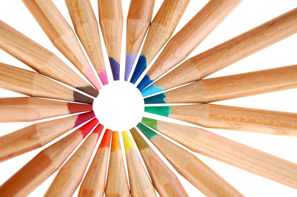
Colour Wheel
A color wheel is a circular diagram that shows the relationship between different colors. The color wheel is divided into primary, secondary, and tertiary colors. Primary colors are the basic colors that cannot be created by mixing other colors. They are red, yellow, and blue. Secondary colors are created by mixing two primary colors together. They are green, orange, and purple. Tertiary colors are created by mixing a primary color with a secondary color. They are yellow-green, blue-green, blue-purple, red-purple, red-orange, and yellow-orange.
The colour wheel can be used to understand how different colours interact with each other. For example, complementary colours are located opposite each other on the colour wheel, such as red and green or blue and orange. These colours can create a vibrant and energetic look when used together. Analogous colours are located next to each other on the colour wheel, such as blue, blue-green, and green. These colours can create a harmonious and balanced look when used together.
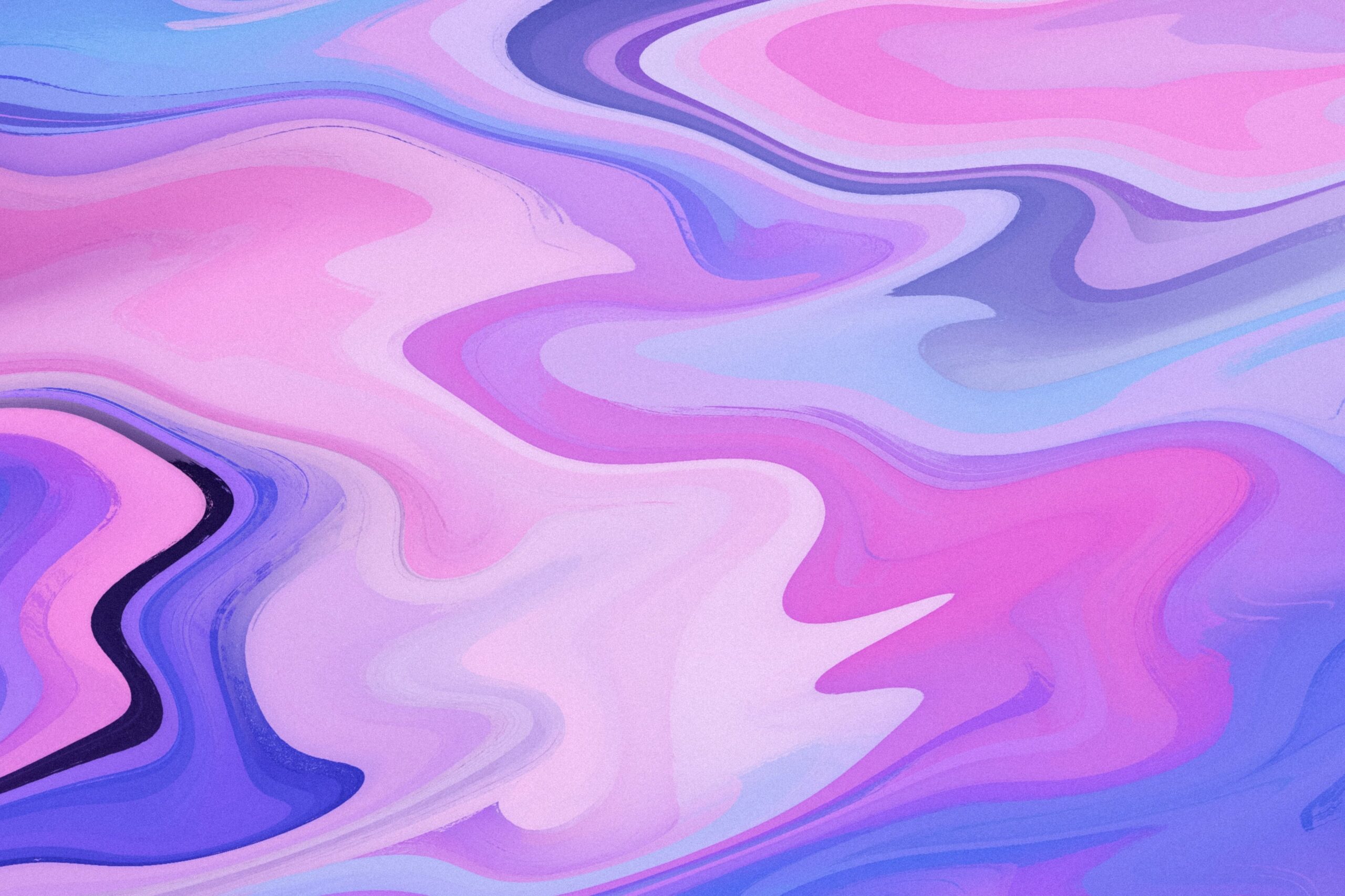
Analogous Colours
Analogous colours are colours that are located next to each other on the colour wheel. For example, blue, blue-green, and green are analogous colours. Analogous colours can create a harmonious and balanced look when used together. They are often found in nature and can create a natural, cohesive look. Especially when you want to achieve a sense of movement from one colour to other analogous colours can help elevate the effect. Overall, the use of analogous colours can add visual interest and harmony to your crochet masterpiece.
Monochromatic Colours
Monochromatic colours are colours that are part of the same colour family and have similar tones and values. For example, a monochromatic colour scheme could consist of various shades of blue, ranging from light blue to dark blue. Monochromatic colour schemes are often associated with a minimalist aesthetic and can create a sense of unity and cohesiveness. When painting monochromatic colour schemes can be achieved by using tints, tones, and shades of a single colour. Tints are created by adding white to a colour, which makes it lighter. Tones are created by adding grey to a colour, which makes it more muted. Shades are created by adding black to a colour, which makes it darker. By using a range of tints, tones, and shades, you can create a monochromatic colour scheme that has visual interest and depth.

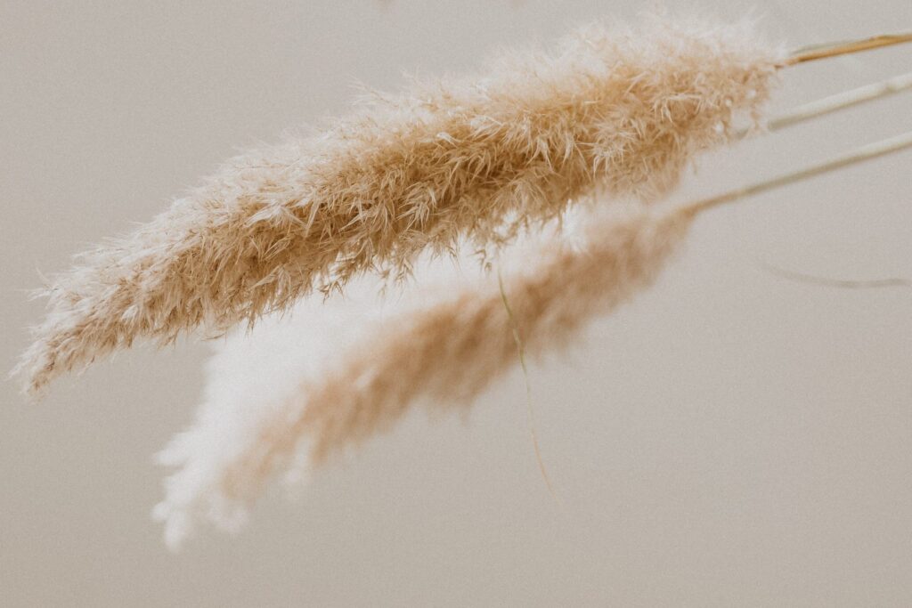
Neutral Colours
Neutral colours are colours that are not bright or bold but are instead muted and subdued. They are often found in nature and can create a calm, relaxing atmosphere. Examples of neutral colours include beige, grey, taupe, and white.
Neutral colours are often used as a background or base in design and decorating. They can provide a blank canvas that allows other colours to stand out and be the focus of the design. Neutral colours can also be used to create a sense of balance and harmony in a design. One of the main reasons that I really like designing patterns with neutral colours!
Where to find Inspiration
Now you’ve learned all about colour theory you might wonder where you might find inspiration for your next project. It might not come as a surprise but inspirations are EVERYWHERE. You can find inspiration for colour combinations in nature, art, and everyday objects. By paying attention to the colours around you, you can start to develop an understanding of which colours work well together and which don’t.
I love to play with those little paint shade cards you can easily pick up in a DIY store. Another brilliant way to play with colours is yarn pegs. Besides this there are some neat website out there that can help you choose your next colour combo. Approach with caution you might find yourself looking for the next best colour combos for hours on end. :)
Color.Adobe: This website, created by Adobe, allows you to explore different color schemes and combinations, and even create and save your own.
Design-Seeds: My absolute favourite. Colour palettes inspired by nature. If you check my Pinterest board on colour combinations you might recognise that the majority of my inspirations comes from there.
What are your tips and tricks to put your colour scheme together? I would love to hear if this post made your life easier or if you’ve got another trick to share.
Stay updated and receive exclusive discount codes in your email inbox

Happy Crocheting!